
B.I.A.S.D.: A Cosmetic Review of Microsoft Office 2013 (Spoilers: B-)
 Welcome to my mini web rant series "Beauty is Actually Skin Deep" where I either praise or eviscerate a product based mostly on its appearance. This week's victim: Microsoft Office 2013, which I got with Office 365 (Student Edition). Here are the things I found distasteful after using it for 30 seconds.1) Inconsistent GUI Behavior
 This is what Word 2013 looks like when it has priority/focus. Nothing seems amiss yet, right?
 This is what Word looks like when a different application has focus. Notice the window borders, there is no visible change in 2013 compared to Explorer. It's still as pale as it was a moment ago. The coloration of a window is often a good, quick visual indicator of what application your mouse and keyboard input will be piped to. So if you have multiple windows/applications open and aren't paying attention, you won't ever be left wondering "wait, where did my text go? Oh, it opened 15 tabs scrolled all the way down this really long page, and sent off a random email."This inconsistent window behavior is pretty sloppy in my opinion. Microsoft is trying to present a unified appearance: pushing Windows 8, with Metro-y goodness, and it's sleek overhaul. But it's own applications follow different GUI rules.2) Your color choices are Bright White, Slightly Less White, and Smokey White.
 These are the default color schemes for Microsoft Office, 2007 on left and 2013 on right. Personally, I find them both a bit too bright and punchy for my tastes. It's eyesore and eyestrain-central.
 Here is Office 2007 showing off "silver," while 2013 is wearing "light grey." 2007 is much more bearable, while there's almost no change in 2013.
 And finally, 2007 dressed in black (my usual choice) and 2013 trying and failing to be a chameleon. It's nominally a shade or two darker than it started. This is one of the reasons I haven't uninstalled 2007 yet, because 2013 would need about... 50... more shades of grey to reach an acceptable level for working in a dark room.3) Cosmetic "features" hinder navigation...
 Just open that image and look at the upper right. Those doodles that Microsoft gives you a generous selection of pretty much ALL camouflage the minimize/maximize/close buttons. This is backwards progress in UI design. Here's another:
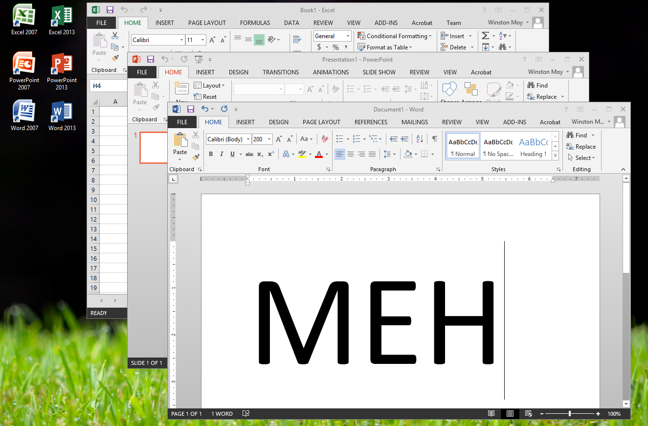
 Even worse. Luckily Microsoft gives you the option of disabling that tacky window tattoo. But seriously, what were they thinking? I would've even liked an ugly faux leather or aluminum skin from Apple more than this "art"... It even obscures the tabs in the ribbon!ConclusionThere are some things I liked, aesthetically about Office 2013. The bottom status bar looks very clean, and occupies less vertical real estate, which is good. That tacky "Office" button in 2007 is given it's own tab in the ribbon. The ribbon itself has been slightly tweaked to present a better layout of options, although I don't like the fact that they're all flat icons now. They look like indicators, instead of traditional buttons that encourage interaction.But there are some pretty basic areas where I feel the UI lets me down, and lowers my opinion of Microsoft as a software maker. And although I'm sure many of you will disagree, I'm sure many others will share at least one of my peeves. At the very least, they'll be underwhelmed by Office 2013 (not that Office was ever supposed to 'Wow' you), and that sentiment could not come at a worse time for Microsoft.Grade: B-Interpretation: Meh, you tried. And fundamentally it's a sound product, but it isn't particularly special. About average, maybe a hair less.Note: I am discussing the local software alone, not the cloud services of Office 365, which I have yet to put to the test.